Visual Basic 6 has many in-built controls available to get the simple jobs done.
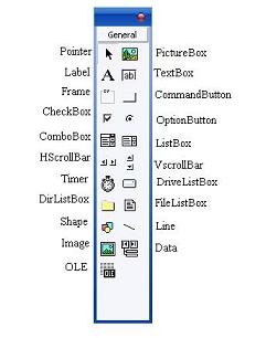 You can get more Active X controls by right clicking the toolbox and selecting the components. 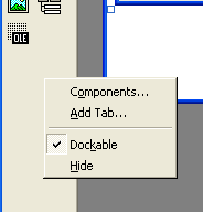 When you will click components a Dialog will popup and you can select the components to use from there. | The Controls Beside are VB6 in-built controls. The Picture box can be used to add pictures and also acts as a container to store other controls. The Label Control is Used to display text by setting its caption Property. The TextBox control is used to take user's input in the form of text. The Frame is used as container to group controls. The Command Button is used as a Button for performing tasks whatever. CheckBox is used to take user input, OptionButton or Radio Button is used for selecting an option in 2 or more options. Combo Box provides a select-able collection to choose from a list of items. The List Box is used to display a list. H and V Scroll Bar are used to add scrolling capabilities. The timer fires up a block of code at a set time interval. The DriveListBox is used to get the drive address as user input. The Dir List Box lists the Directories or Folders. The File list box lists the files. The Shape control is used for adding Different kinds of Shapes and it doesn't fire any event. The line event has similar function. The Image Control is used to display Image, It has some differences from picture box. Data is used for database access. OLE is used for adding object modules of different components. |
Picture Box
The Picture Box is one of the controls that is used to handle graphics. You can load a picture at design phase by clicking on the picture item in the properties window and select the picture from the selected folder. You can also load the picture at runtime using the LoadPicture method. For example, the statement will load the picture grape.gif into the picture box.
Private Sub Form_Load()
Picture1.Picture = LoadPicture("C:\VB program\Images\grape.gif")
End Sub
Picture1.Picture = LoadPicture("C:\VB program\Images\grape.gif")
End Sub
There are many properties we can set for the picture box like its background, border style etc.
Label
The label is a very useful control for Visual Basic, as it is not only used to provide instructions and guides to the users, it can also be used to display outputs. One of its most important properties is Caption. Using the syntax label.Caption, it can display text and numeric data . You can change its caption in the properties window and also at runtime. Try the code below.
Private Sub Form_Load()
Label1.Caption = "Hello VB6"
End Sub
Label1.Caption = "Hello VB6"
End Sub
You can set the Alignment, Font, border, transparency of background, background and font colors etc.
TextBox
The text box is the standard control for accepting input from the user as well as to display the output. It can handle string (text).String in a text box can be converted to a numeric data by using the function Val(text). The following example illustrates a simple program that processes the input from the user. Make sure you have a label and textbox in the form
Private Sub Form_Load()
Label1.Caption = "Hello " + text1.Text
End Sub
Label1.Caption = "Hello " + text1.Text
End Sub
You can set Multiline, Scrollbars, Alignment and other properties in the text box element.
Frame
 | Frame is used as a container to store other controls. This is not usually used but can be a good tool if you want to help a user understand the context of your program. Grouping becomes necessary in complex programs. The controls are added at design time. The picture box can also be used as a frame if required. |
Command Button
The command button is one of the most important controls as it is used to execute commands. It displays an illusion that the button is pressed when the user click on it. The most common event associated with the command button is the Click event, and the syntax for the procedure is
Private Sub Command1_Click()
MsgBox "I've Been Clicked"
End Sub
MsgBox "I've Been Clicked"
End Sub
In the above example the _Click() is an event. The code before End Sub is fired when a user clicks the Command1. The MsgBox is a Function which we will discuss later.
Check Box and Option Button
The Check Box control lets the user selects or un-selects an option. When the Check Box is checked, its value is set to 1 and when it is unchecked, the value is set to 0. You can include the statements Check1.Value=1 to mark the Check Box and Check1.Value=0 to un-mark the Check Box, as well as use them to initiate certain actions.
Private Sub Command1_Click()
If Check1.Value = True Then
MsgBox "I've Been Clicked"
End If
End Sub
If Check1.Value = True Then
MsgBox "I've Been Clicked"
End If
End Sub
The above Example used If Else Conditional Statements which will be discussed later. The above program checks if the CheckBox value is true, If it is True then a message will be displayed.
The Option Box control also lets the user selects one of the choices. However, two or more Option Boxes must work together because as one of the Option Boxes is selected, the other Option Boxes will be unselected. In fact, only one Option Box can be selected at one time. When an option box is selected, its value is set to “True” and when it is unselected; its value is set to “False”.
The Option Box control also lets the user selects one of the choices. However, two or more Option Boxes must work together because as one of the Option Boxes is selected, the other Option Boxes will be unselected. In fact, only one Option Box can be selected at one time. When an option box is selected, its value is set to “True” and when it is unselected; its value is set to “False”.
Private Sub Option1_Click ( )
Shape1.Shape = 0
End Sub
Private Sub Option2_Click()
Shape1.Shape = 1
End Sub
Shape1.Shape = 0
End Sub
Private Sub Option2_Click()
Shape1.Shape = 1
End Sub
The above example should have 2 option Buttons and a shape element.
Combo Box
The function of the Combo Box is also to present a list of items where the user can click and select the items from the list. However, the user needs to click on the small arrowhead on the right of the combo box to see the items which are presented in a drop-down list. In order to add items to the list, you can also use the AddItem method.
Private Sub Form_Load()
Combo1.AddItem “Item1”
Combo1.AddItem “Item2”
Combo1.AddItem “Item3”
Combo1.AddItem “Item4”
End Sub
Combo1.AddItem “Item1”
Combo1.AddItem “Item2”
Combo1.AddItem “Item3”
Combo1.AddItem “Item4”
End Sub
You can also add items to combo through the properties window.
List Box
The function of the List Box is to present a list of items where the user can click and select the items from the list. In order to add items to the list, we can use the AddItem method. Items are added to the list box the same as combobox.
Timer
A timer can be used to fire an event at a set interval. Check the example below:
Private Sub Form_Load()
Timer1.Interval = 100
End Sub
Private Sub Timer1_Timer()
Label1.Caption = Time
End Sub
Timer1.Interval = 100
End Sub
Private Sub Timer1_Timer()
Label1.Caption = Time
End Sub
In the above example we set the timer's interval to 100 miliseconds. This can be done through the properties window. The timer updates the current time in a label.
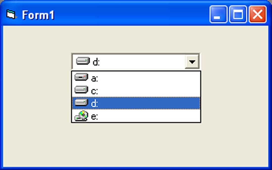
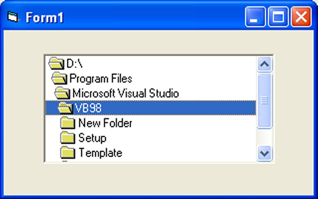
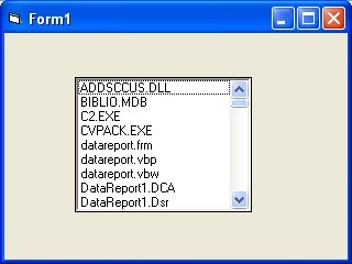
Drive/Directory/File Lists
These are simple tools for retrieving file from the user. We'll discuss about them later.
 |  |  |
Image
Nothing to say much about this. This is used to display images. Set the picture property in same way as you do with picture box. You can resize the pictures.
Other Controls will be discussed sooner or later because they are not much important for a beginner.
Other Controls will be discussed sooner or later because they are not much important for a beginner.
Properties
| Before writing an event procedure for the control to response to an event, you have to set certain properties for the control to determine its appearance and how it will work with the event procedure. You can set the properties of the controls in the properties window or at runtime.on the right is a typical properties window for a form. You can rename the form caption to any name that you like best. In the properties window, the item appears at the top part is the object currently selected. At the bottom part, the items listed in the left column represent the names of various properties associated with the selected object while the items listed in the right column represent the states of the properties. Properties can be set by highlighting the items in the right column then change them by typing or selecting the options available. The Panel below the property window displays information about the selected property. | 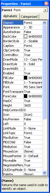 |
 RSS Feed